Gudhaus
University Project
Team of 3
Güdhaus Corporation was created as a submission to the RSA Student Design Awards.
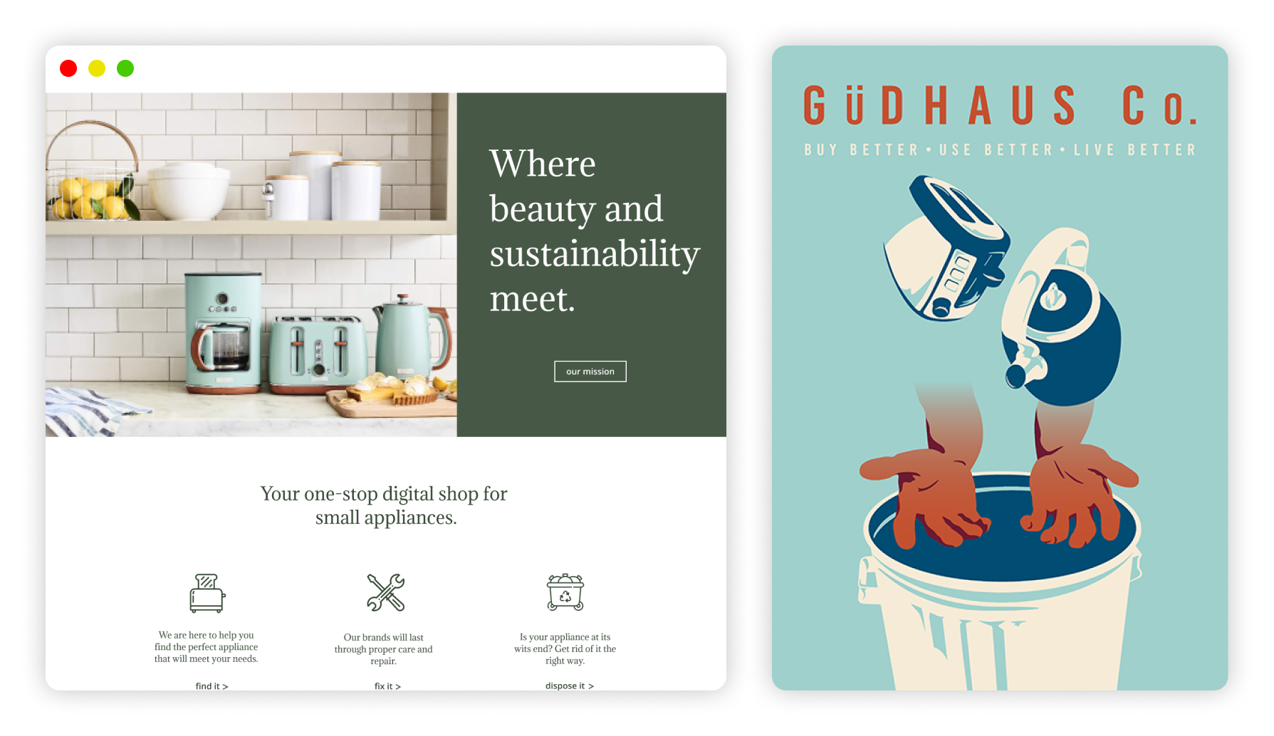
The company concept encouraged long-term, sustainable thinking by reducing e-waste.
My team and I created a company model providing recycling resources, repair services, and selling new environmentally-friendly small appliances.
Poster Design
Designs Created by Me
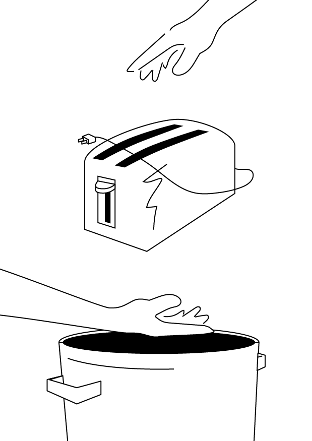
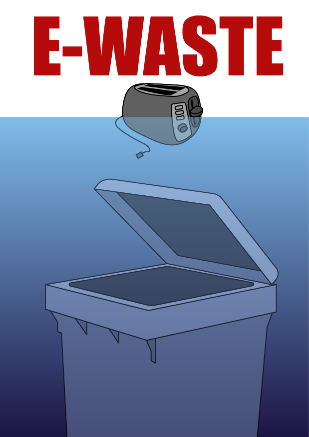
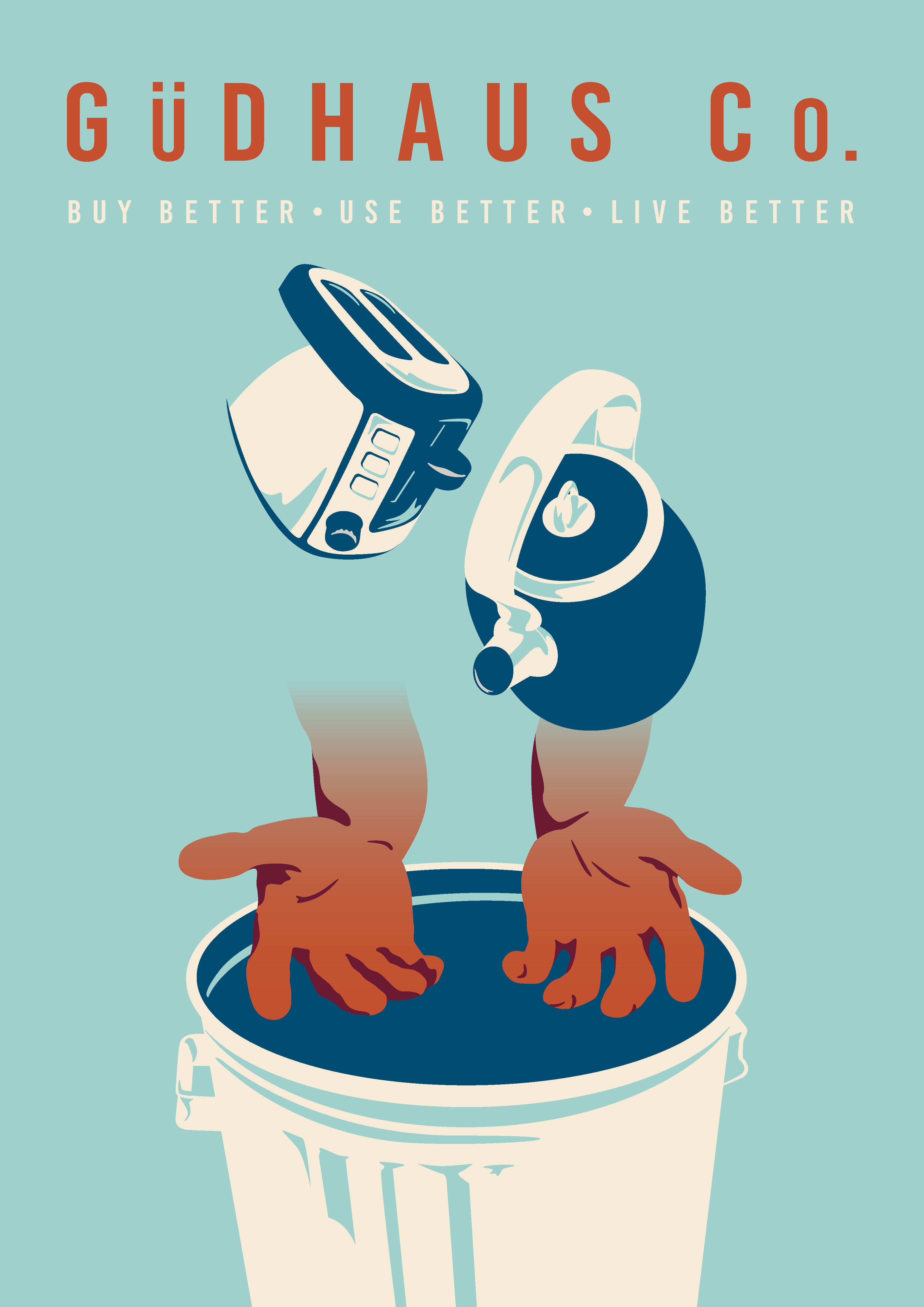
The images below demonstrate my design process. From initial sketches of rough ideas, to high-fidelity mockups, and the final version.
The finished poster (right) was designed to convey the "essence" of our project idea. The outstretched hands represent Gudhaus Co. stopping the e-waste from being thrown in the garbage. Hence the orange accent colours being used to draw a visual connection between the company name and the hands.
Ideation
Group Collaboration
The design and development process began with formulating our ideas, creating rough mockups, and storyboarding.
The first two idea boards were created using Miro.
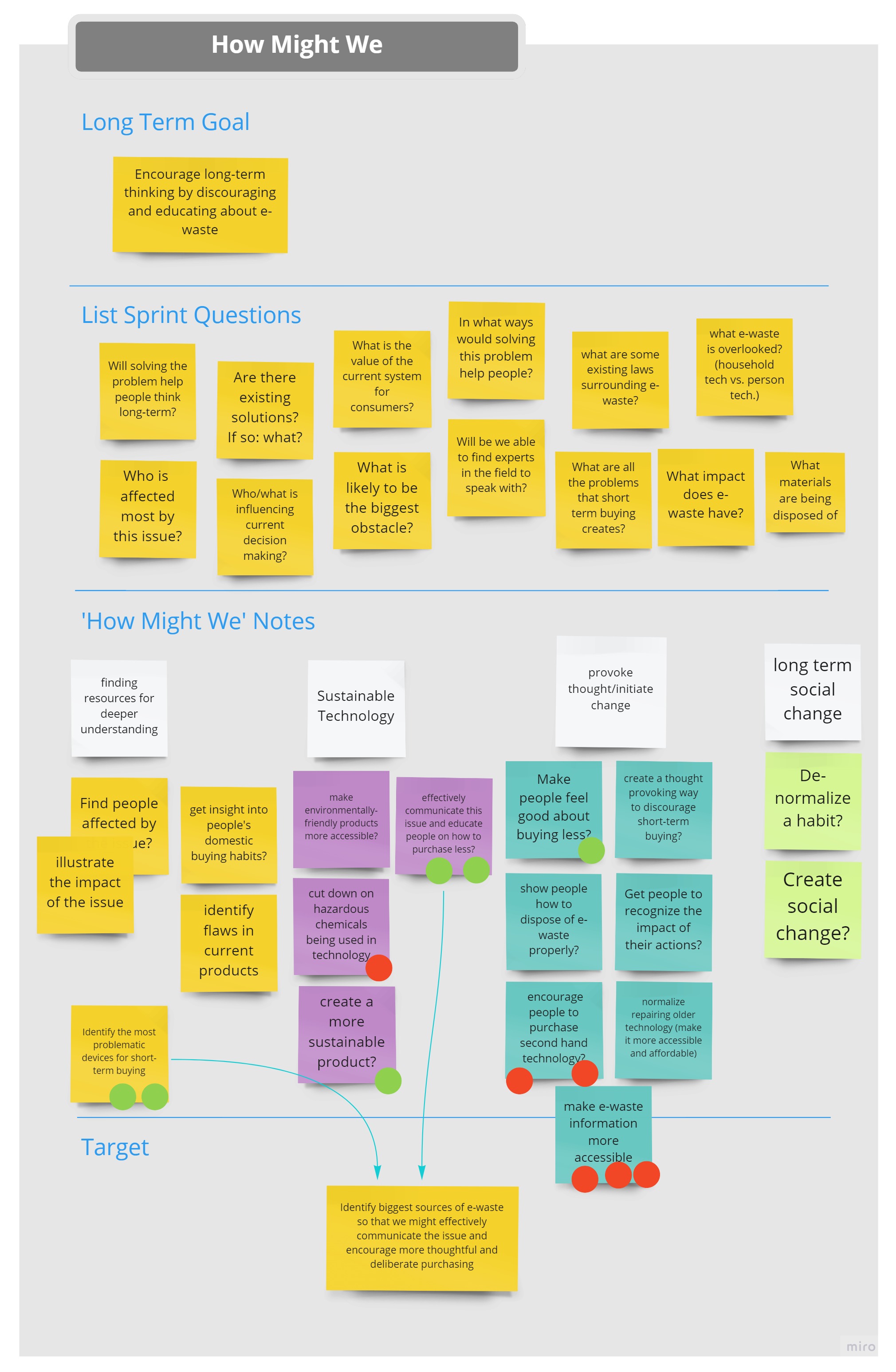
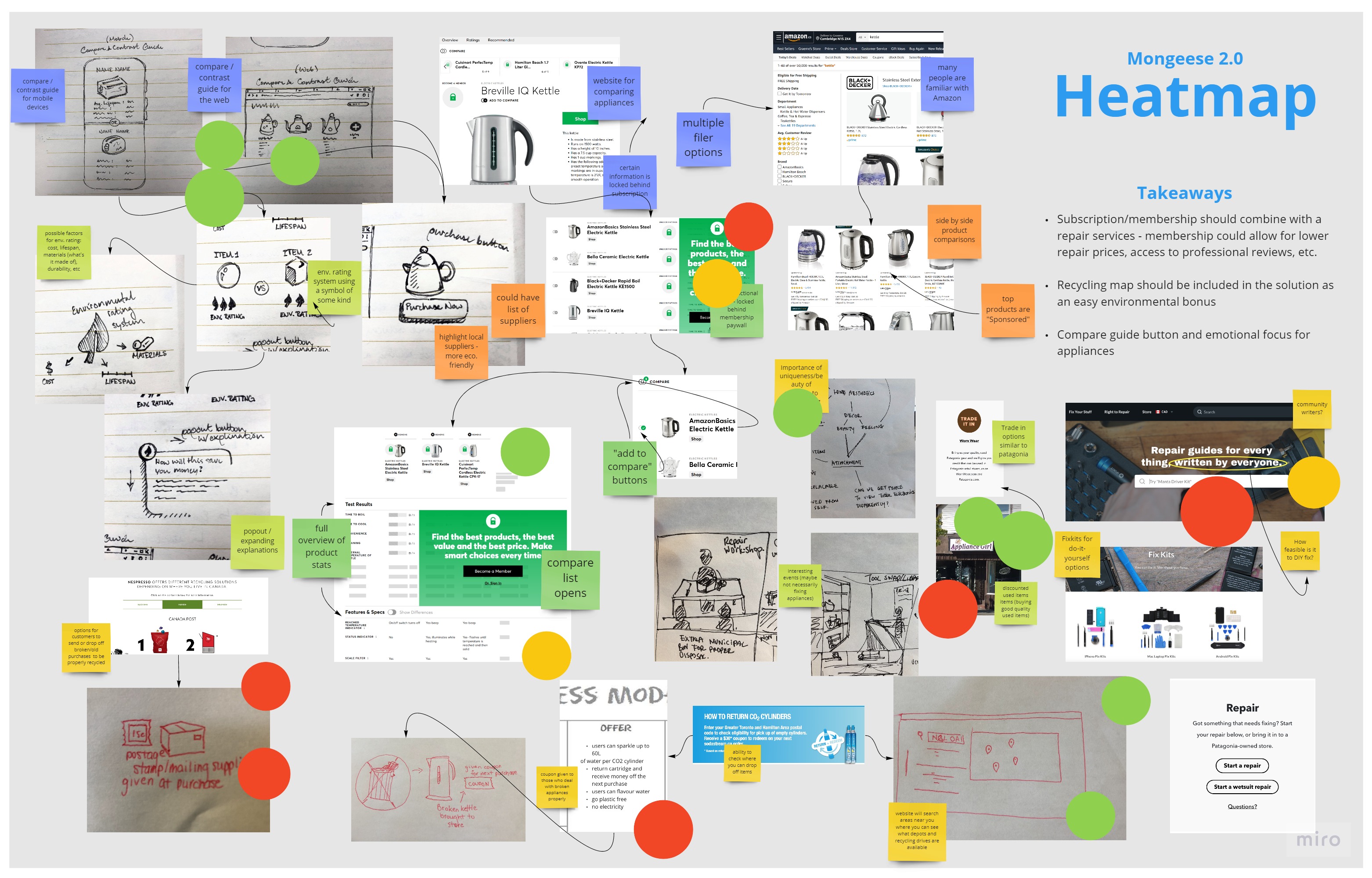
Below are the two pages of sketches I created to illustrate the group's ideas.
On the first page (left), I came up with various ideas for content distribution on a website. The second page (right), storyboards customer interaction based on our user research.
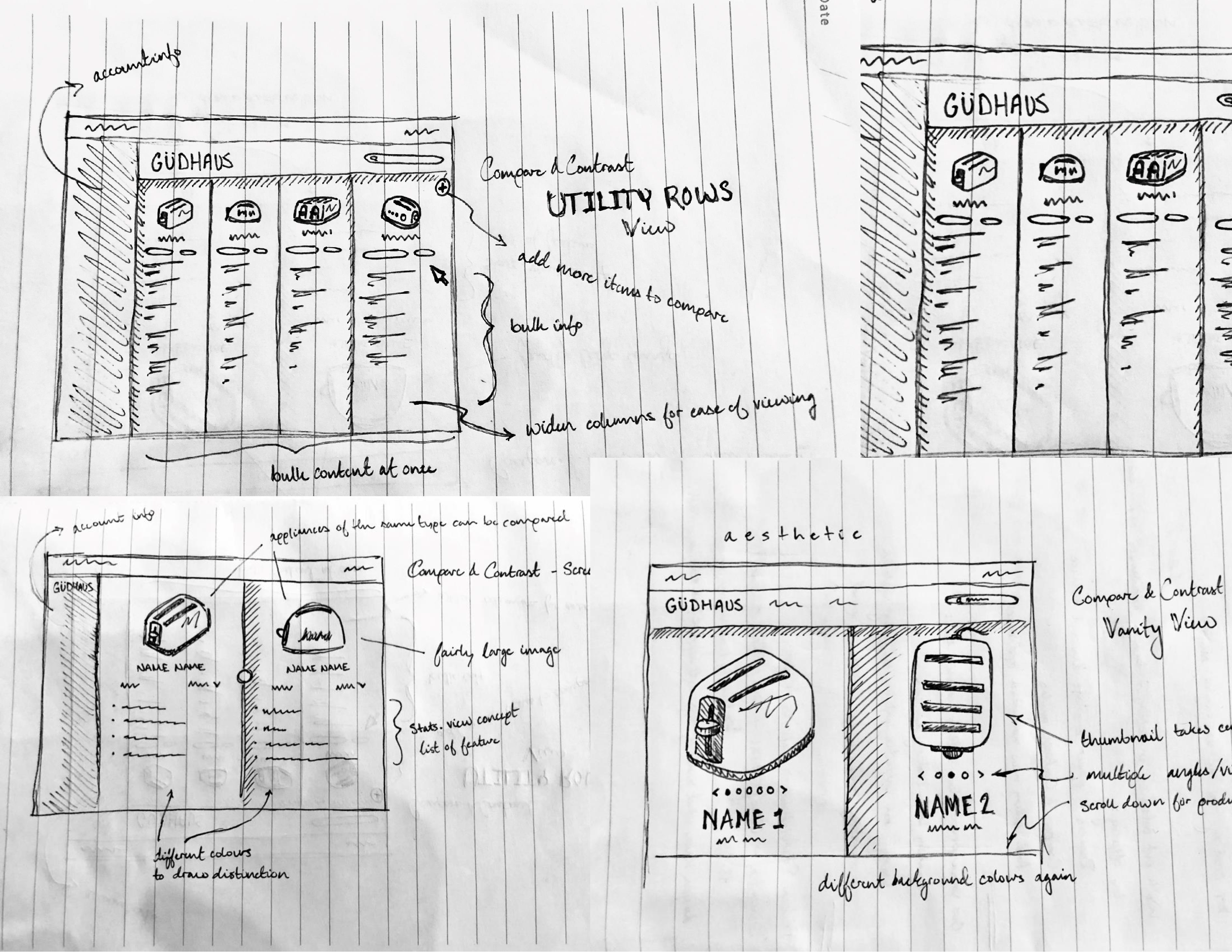
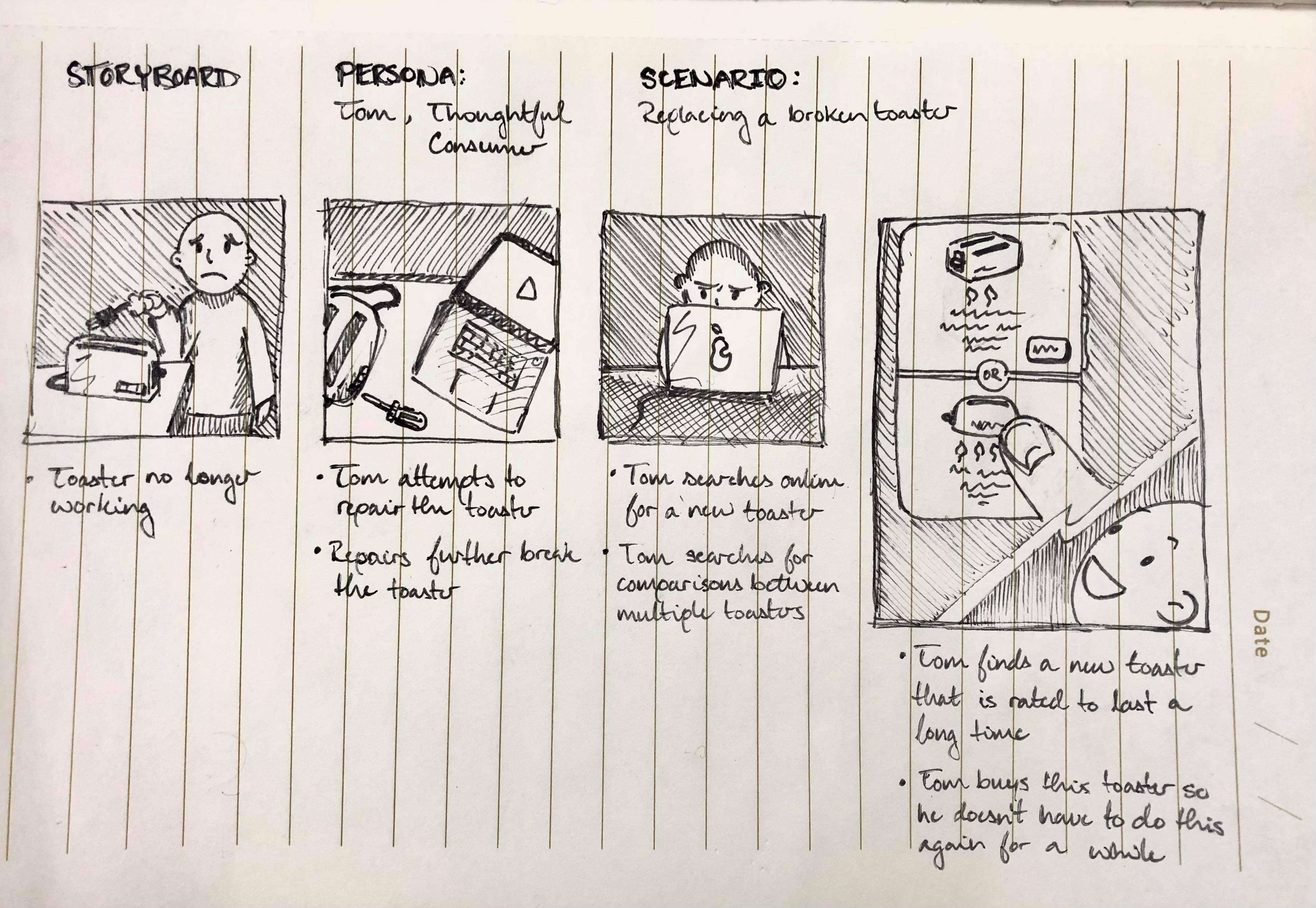
From this rough work, the team could decide the key problem areas and how to provide value.
We identified convenience as our key value. Which we then used to highlight the positive attributes and decide what should contribute to the final project.
Proposal Boards
Group Collaboration
We created the product Proposal Boards below, which explain the problem, how we discovered it, as well as our solution.
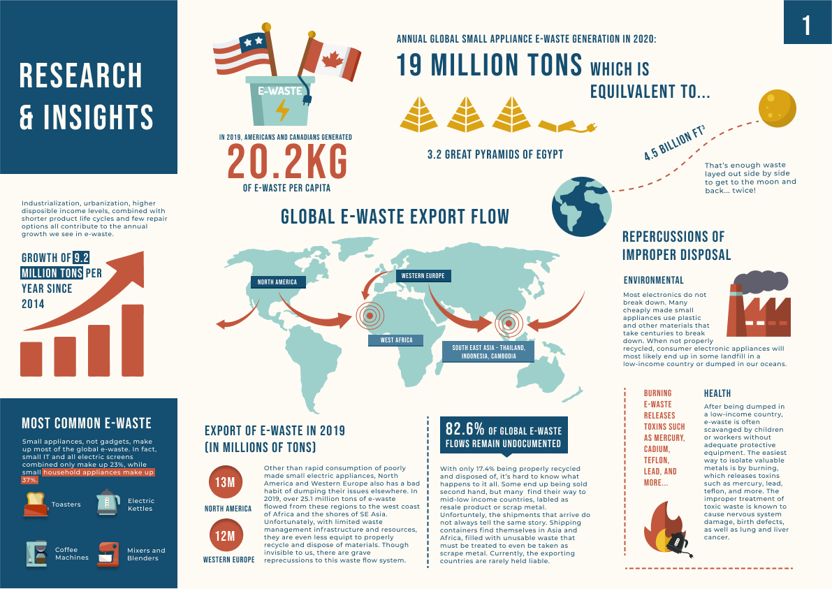
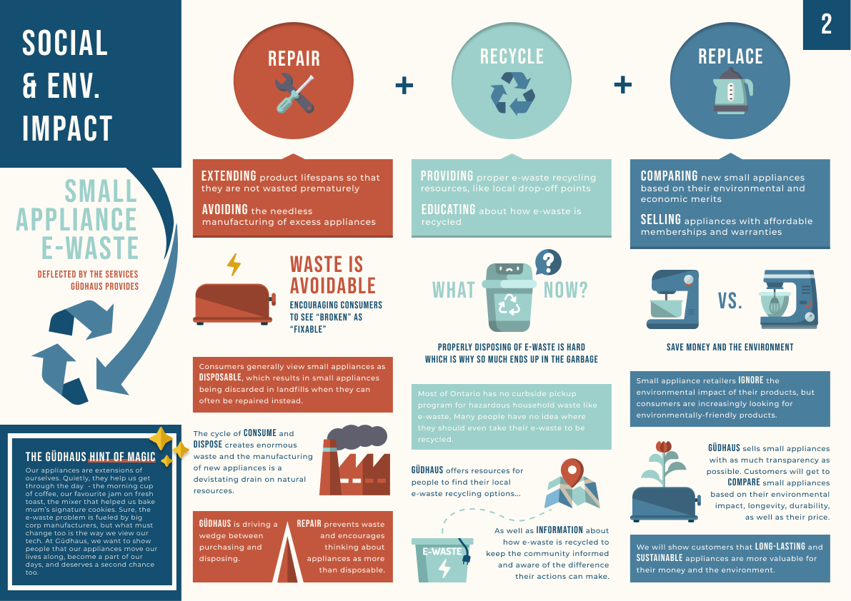
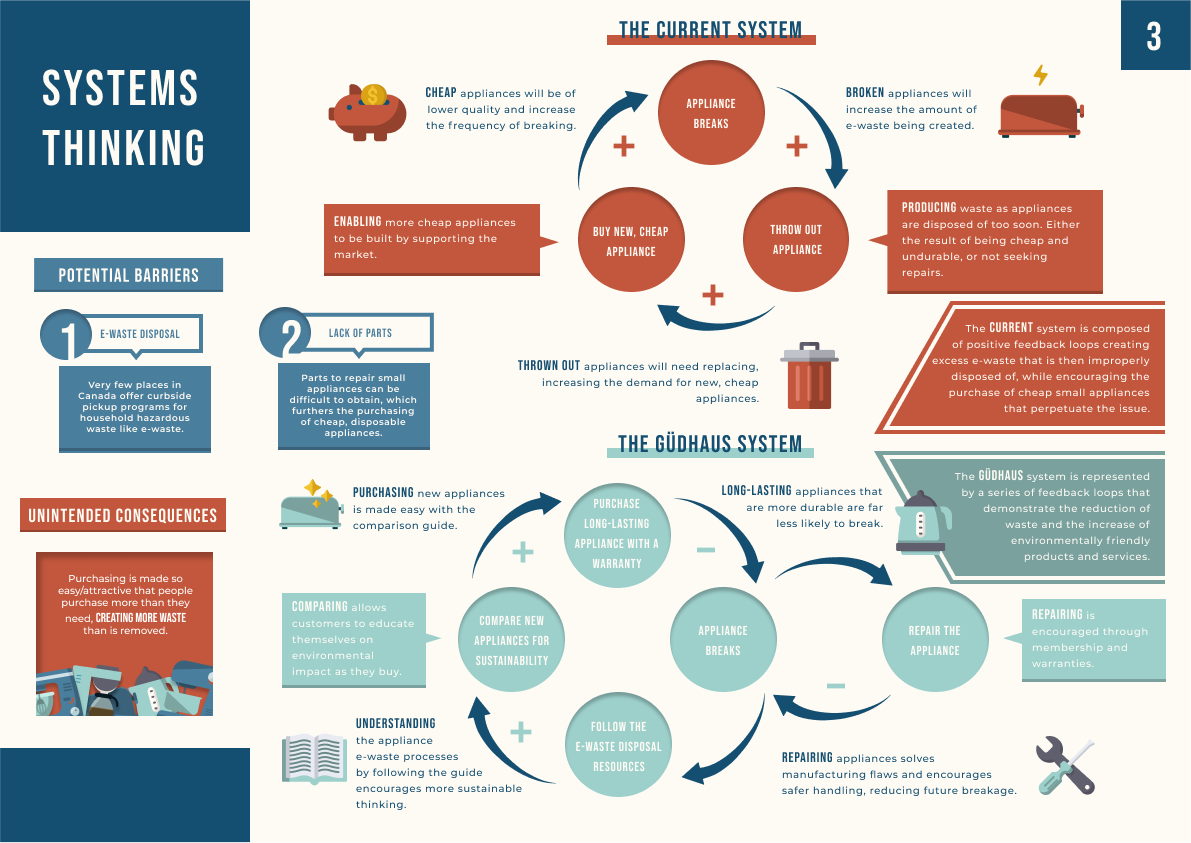
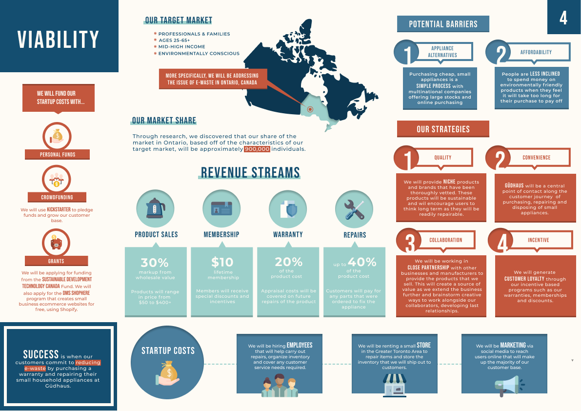
The Proposal Boards were designed in Figma.
I created the Social & Environmental Impact (#2) and Systems Thinking (#3) boards, which summarize important aspects of our project with visual aids designed to engage readers.
Website Design (Compare & Contrast Page)
Created by Me
For the final aspect of the project, we designed a website in Figma that would host the environmental resources we had created.
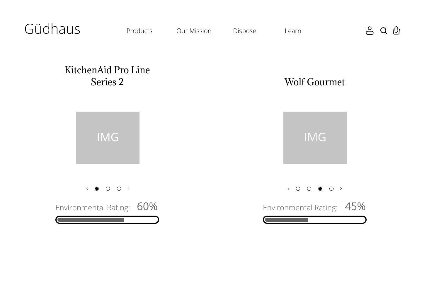
The website wireframe was created using my sketches as a reference.
In the wireframe, we mapped out the primary functions and user flow.
The Compare & Contrast appliances page (left) was my design and is important for educating users on electronic waste variables.
The development of the Compare & Contrast page can be seen below.
The basic wireframe was developed into a rough mockup, tested, and iterated until it became the final version.
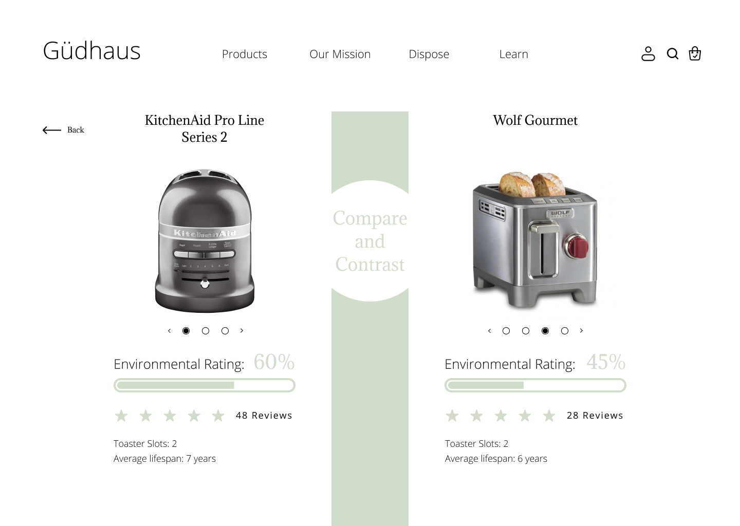
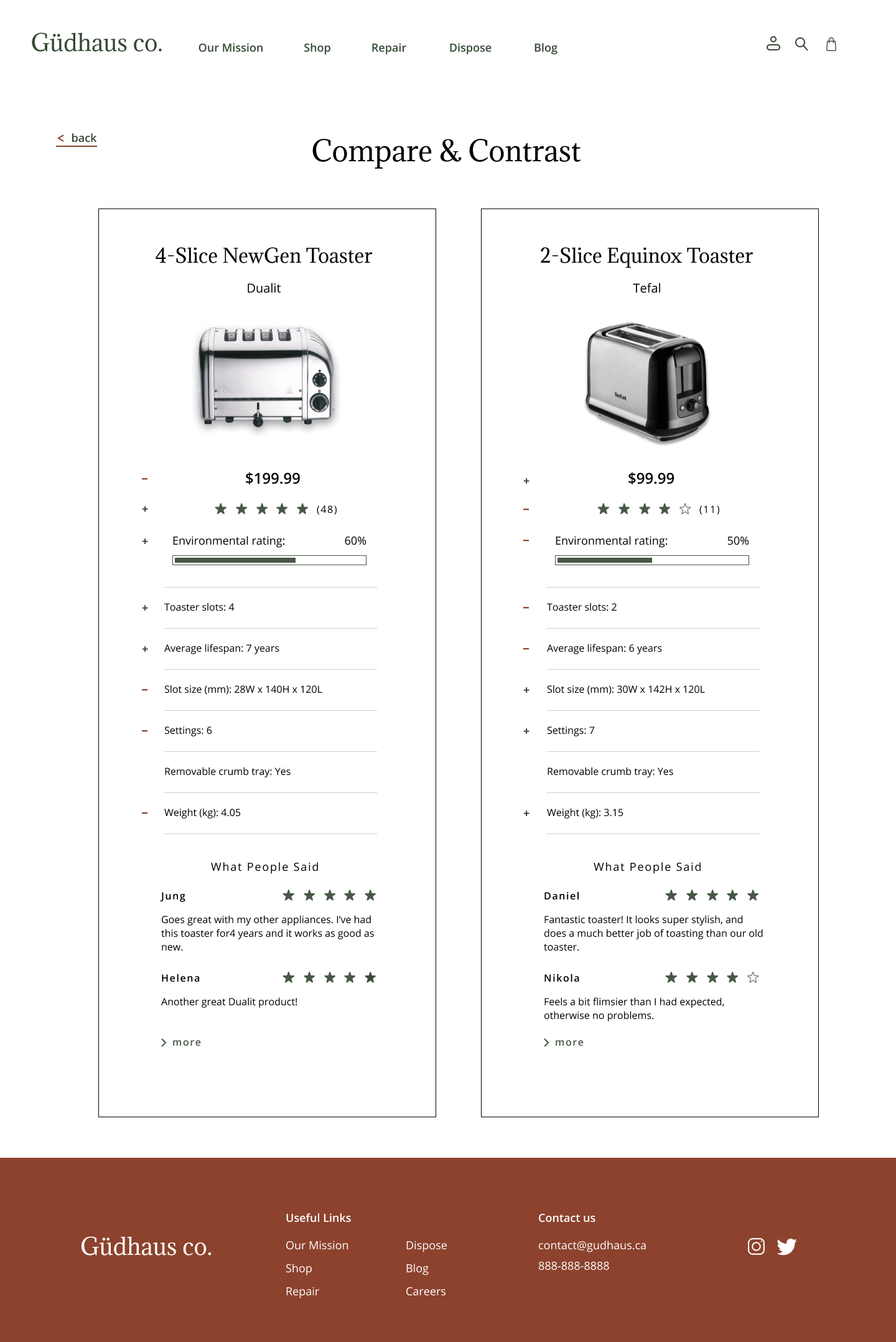
The updates I made include adding more product information, indicating positive and negative traits, and increasing contrast to meet the needs of users with visual impairments.